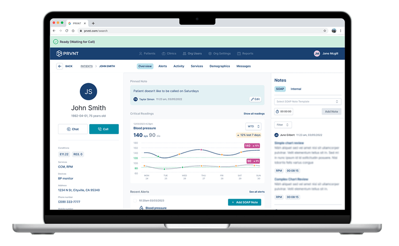
Healthcare / PRVNT
Keep the patient in view.
Calling, clinical notes and monitoring information share a care-team workspace. The design brings the information closer to the conversation it supports.
Inside the work

UX research / Product & interface design
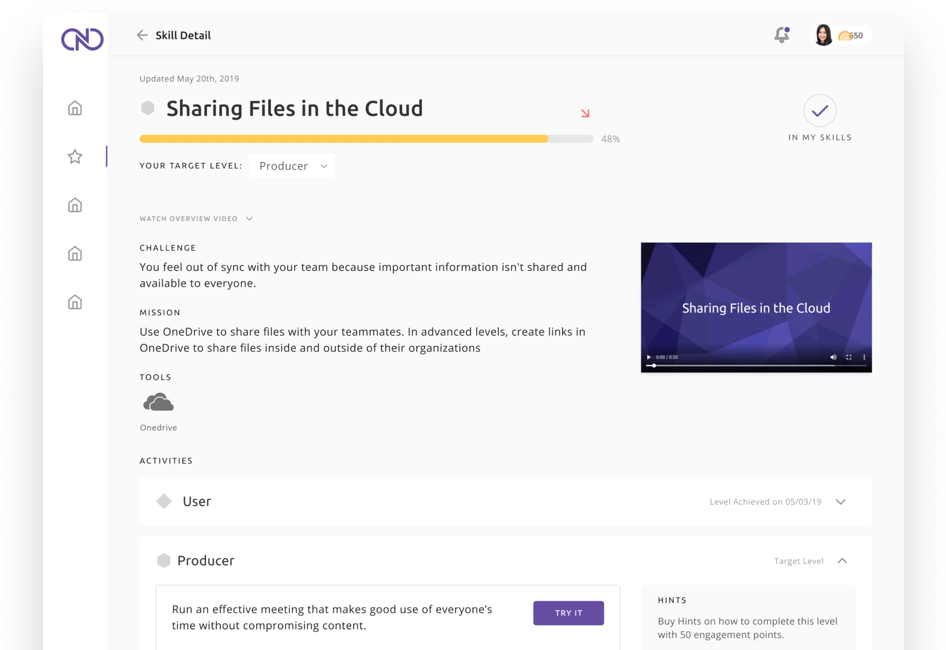
A care team reviewing a patient. An educator shaping a lesson. A person learning a new skill. We design the details that help people find their way and get things done.
Designed around the work
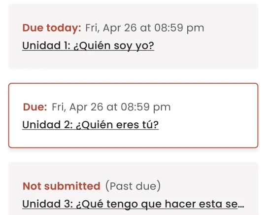
Every product has its own language, pressures and people. The design has to understand them.
Healthcare / PRVNT
Calling, clinical notes and monitoring information share a care-team workspace. The design brings the information closer to the conversation it supports.
Inside the work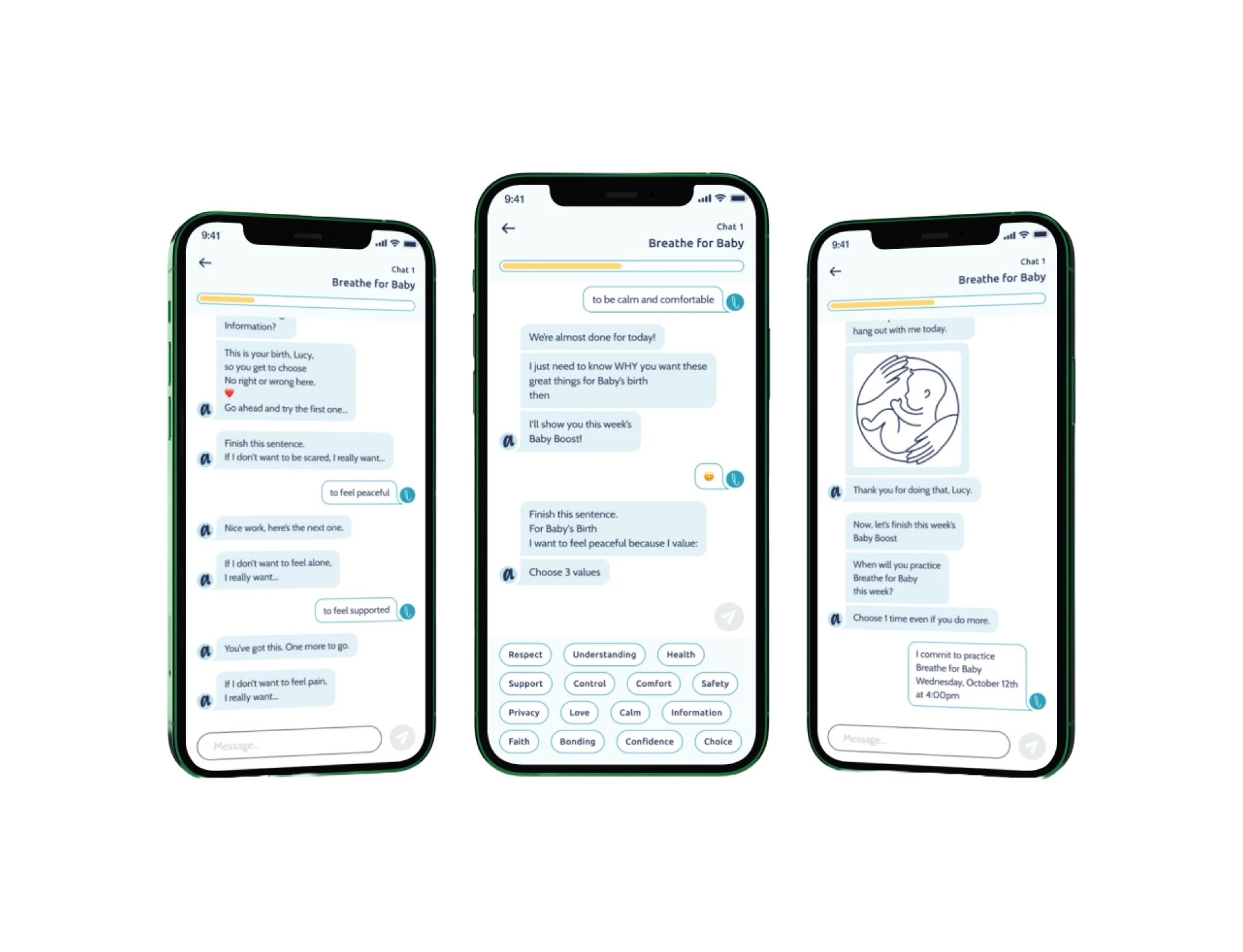
Research & wellbeing / TrueMotif
Message length, conversational pauses and response choices translate coaching content into a mobile experience. User feedback informed the pacing.
Inside the workInside the craft / LingroLearning
Our audit and redesign looked at the platform from instructor and student perspectives. The deliverable was prioritized recommendations and high-fidelity designs for the team to evaluate and plan for implementation.
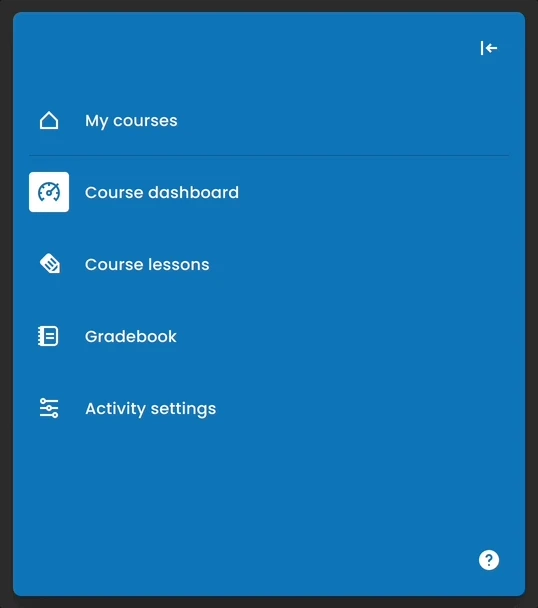
01 / Navigation
A learning platform serves different roles and tasks. The redesign brought navigation and information architecture into focus so the experience had a clearer organizing structure.
The decisionGive everyday tasks a recognizable place within the product.
Explore the project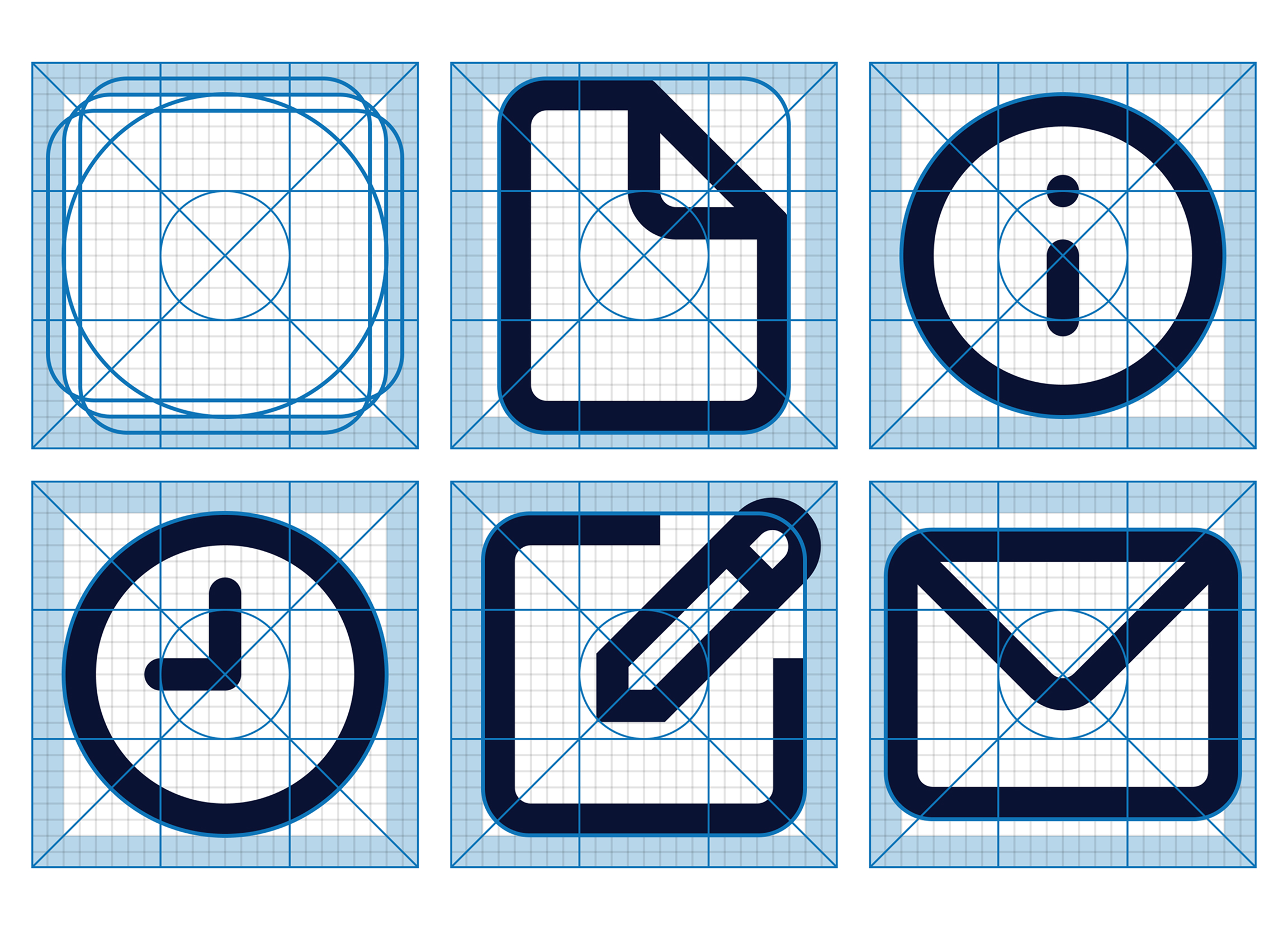
02 / Visual language
Icons had accumulated over time, with different styles and ambiguous meanings. We reconsidered the function and appearance of each element alongside the updated interface.
The decisionUse a consistent visual language to reinforce what an action means.
Explore the project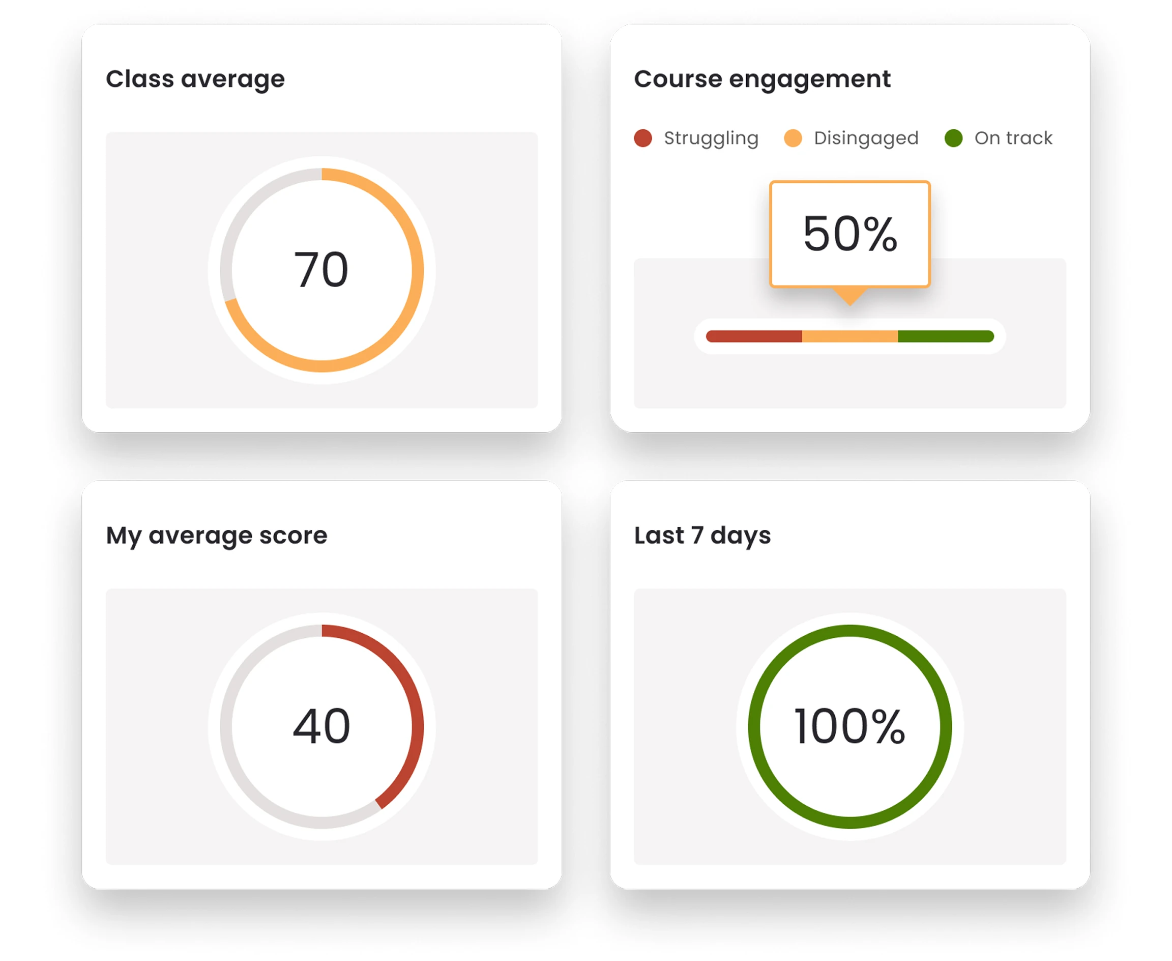
03 / Information hierarchy
Existing performance summaries were difficult to interpret. We revised chart choices, labeling and visual hierarchy to surface essential information while keeping detail available.
The decisionHelp a person understand what they are looking at before asking them to explore more.
Explore the projectAn interface has more than one state
Loading, empty results, errors and recovery are part of the experience. So are keyboard access, readable content and a clear explanation of what just happened.
A useful invitation and one clear action help someone begin.
Feedback belongs beside the result. Keep the next action in reach.
Your latest changes haven’t synced. Keep this window open and try again.
Try again ↻Say what happened, what it means for the work and what someone can do next.
Illustrative lesson editor. This is not a client interface. Accessibility requirements and testing are agreed for each engagement.
AI can help us explore interface directions and make prototypes sooner. We evaluate them against the task, feedback from people and the details of the working product.
From the first question to the working experience
We can join a new product, investigate an experience that has become difficult to use, or bring consistency to a growing platform.
Map tasks, friction and competing needs. Organize the findings around what matters to the people doing the work.
Try navigation, content and interactions. Make design choices tangible enough to discuss, test and refine.
Define components and states, then work with engineering to carry the decisions into the built experience.
Let’s make it clearer
Show us the experience, who uses it and the moments you want to improve.