

LingroLearning / Platform redesign
Redesigning how teachers and learners use LingroLearning.
We helped LingroLearning evaluate and redesign its language-learning experience, with prioritized recommendations and high-fidelity designs for the next stage of the platform.
Explore the story ↓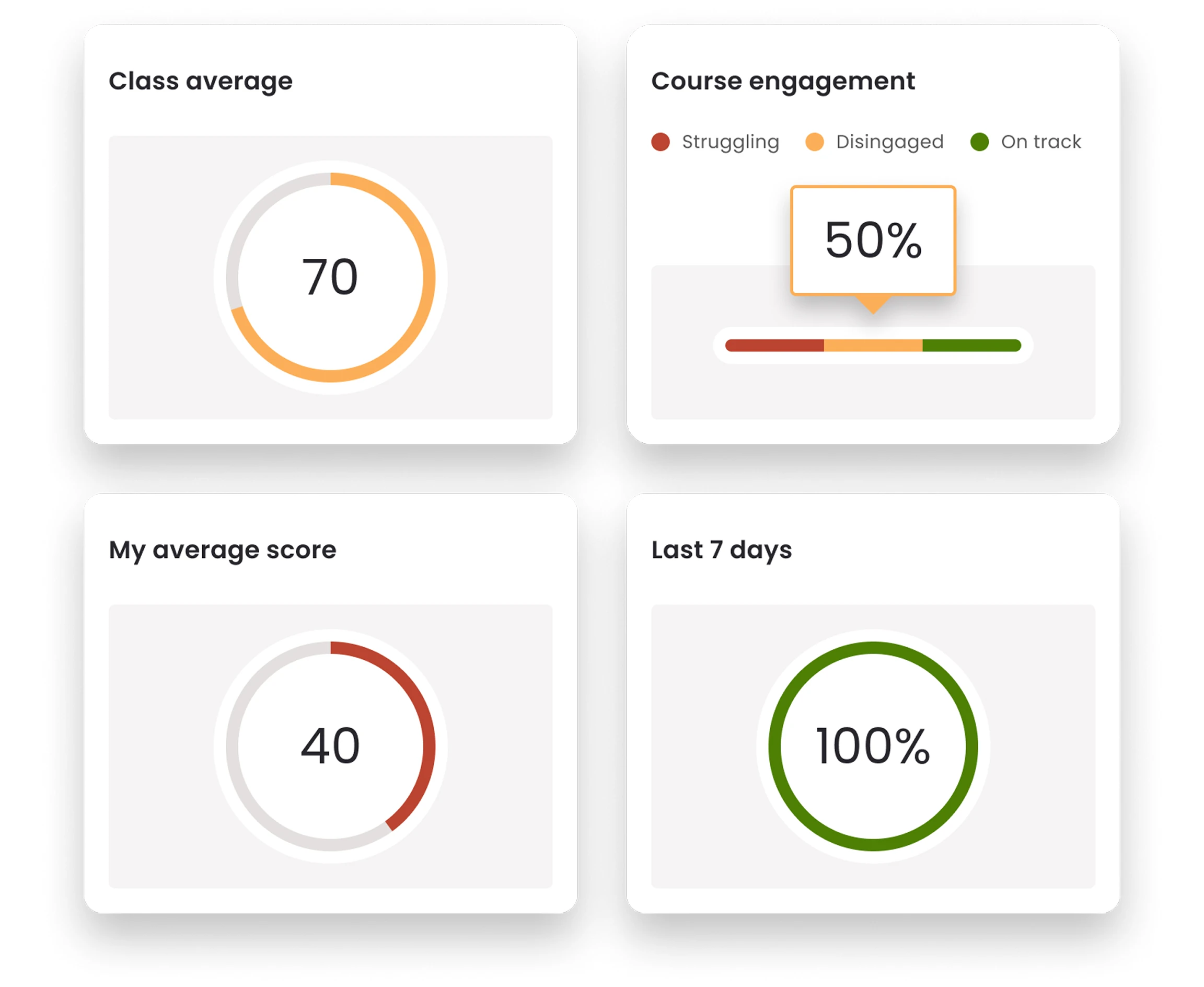
01 / The challenge
Rich learning tools need a clear path.
LingroLearning offered a rich collection of instructional content and tools for language courses. As the platform evolved, the team wanted clearer paths for instructors and students through that growing capability.
More about the challenge
The client asked for improvements to the look, information architecture and content-management experience, along with a sense of the work needed to implement them.
- Project
- LingroLearning
- Our contribution
- UX audit, information architecture & UI design
- People using it
- Language instructors & students
- Engagement
- Platform redesign
02 / A product decision
Reimagined for modern users
The proposed visual system updates typography, color and interface conventions with attention to accessibility and consistency. It gives the product a clearer identity across its working surfaces.
03 / Inside the work
Understand the platform before changing it.
We audited the interface and key flows from instructor and student perspectives. Alongside navigation and visual consistency, the work identified ways to make lesson creation more understandable.
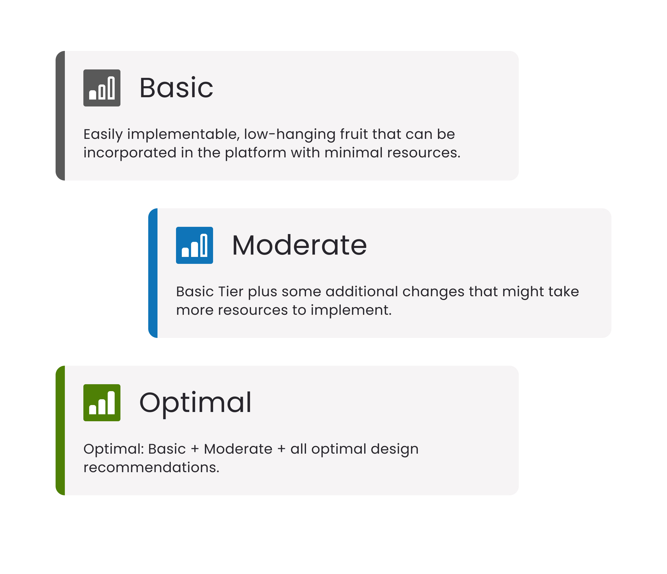
Recommendations were grouped and prioritized by complexity. High-fidelity designs gave the team concrete material to evaluate and plan for implementation.
04 / A product decision
Creating visual clarity
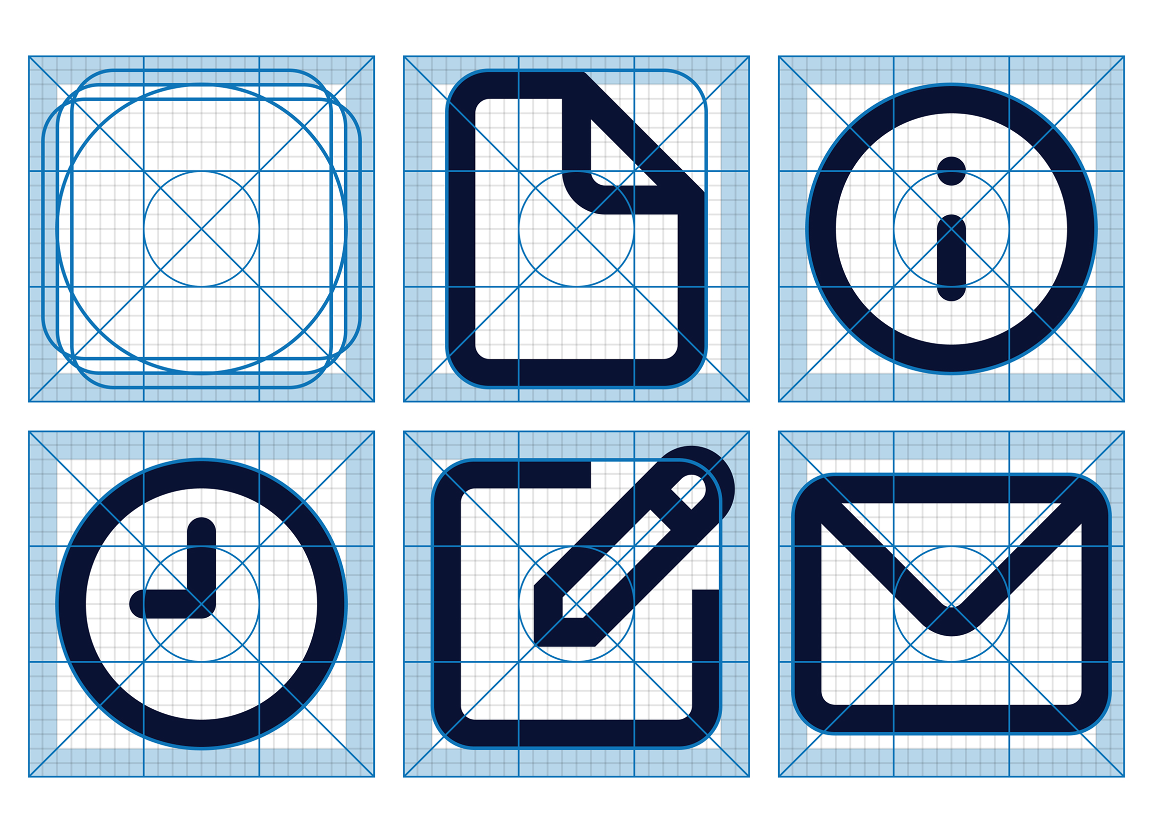
The icons used throughout the platform had been added at different times in LingroLearning’s evolution, introducing inconsistencies in style and ambiguities in meaning. We reevaluated the goal and appearance of each element in relation to its function and to the updated UI, making adjustments as needed to create a consistent, intuitive iconography system to reinforce the platform’s new navigation pathways and updated aesthetic.
05 / A product decision
Instructional content made manageable
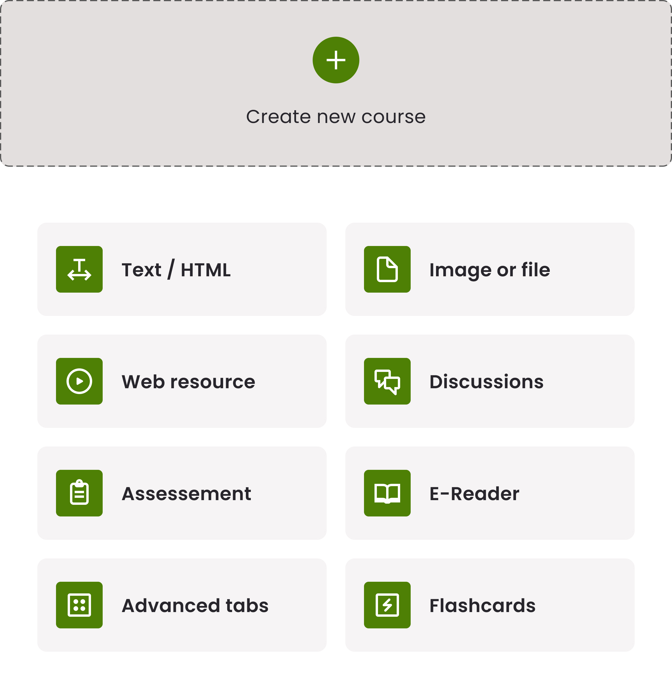
When it comes to creating lessons and activities, LingroLearning offers instructors plenty of options – and wanted to make those choices easier for instructors to organize. We redesigned the content creation interface to surface primary actions (like “add section” and “edit”) and incorporated toasts and help text to help teachers keep track of potential and completed actions within the creation flow.
06 / A product decision
From oversight, to insightful
Research indicated that existing performance summaries were hard to interpret. We revised chart choices, labeling and visual hierarchy so essential information could be seen first, with deeper detail available when needed.
07 / Our contribution
A design direction
the team could act on.
LingroLearning brought a rich language-learning platform and the goals for its next stage. We examined instructor and student journeys, then reworked navigation, lesson creation, reporting and the visual system.
The delivery combined prioritized recommendations with high-fidelity designs. Grouping recommendations by implementation complexity gave the client a basis for planning the next build; this case does not claim that every proposed change shipped.
08 / Product work
A design direction for the next release.
Prioritized recommendations and high-fidelity designs give the team a practical basis for planning.
Work with Twenty Ideas
Bring us the work
you want to make possible.
Tell us who it is for, where the experience breaks down and what needs to change.
How we build and evolve products